Typefaces |
||
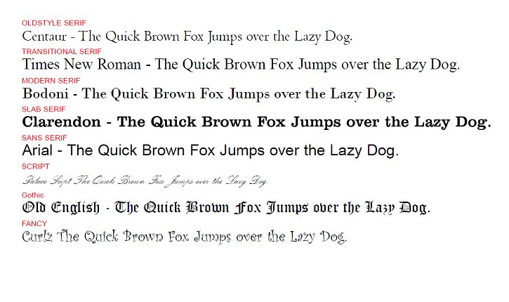
| One of the first choices that will need to be made is: Which typeface? Each typeface has its own characteristics, and this is where it gets subjective, the designer must use their experience and judgment to make a selection that fits in with the subject in the text. It tends to rely on gut feeling, rather than science. This affinity of typeface with subject or product applies more to advertising and leaflets than to book design. In book design, the main criterion is the uninterrupted flow of information to the reader. Therefore subtly is the watch word. A general rule on choice of typeface is that serif faces (Times, Century, Plantin, etc.) are more readable than sans serif (Helvetica, Univers, Arial, etc). Typefaces fit into different categories. I've given you one example for each of the major ones, but please remember there are thousands and thousands of different fonts. |
||