Legibility & Readability |
||
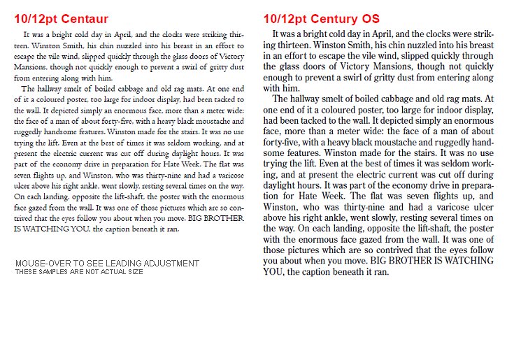
| Legibility is vital. Anyone viewing a printed item must be able to easily see and recognise what is in front of them. There is no point setting a leaflet intended for the elderly, in 6 point type, or technical instructions in an ornate typeface. Readability is subtly different, this is ensuring the message in the text comes across to the reader with the least interference. If the leading (space between lines) is too small, and to a lesser extent, too large, some adjustment may be necessary. Typefaces with long ascenders and descenders, with a small ‘x’ height (body size), require less leading. A large ‘x’ height with short ascenders and descenders requires more leading. These two examples are both set in 10pt with 12pt leading (standard 20%) and to the same measure. The left column is set in Centaur. It has a small ’x’ height with long ascenders/descenders, thus appearing small. Increasing the type size and reducing (proportionally) the leading it has become more readable. The right-hand example, set in Century OS has a large ‘x’ height with short ascenders/descenders and appears cramped. Just by increasing the leading we obtain a better result. |
||